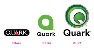
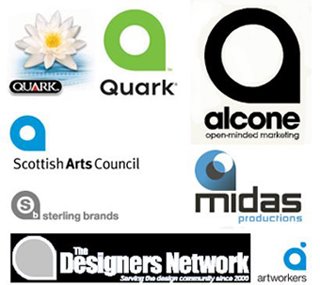
 You be the judge (hmmm...). Quark claims it was a fluke, and a simple mistake. And while that may very well be true, I feel compelled to point out that it doesn't even really look like a q. It looks more like an a. But the colour is very nice, and I was impressed when I read what Lester Haines at theregister.co.uk had to report on it:
"In support of the launch of Quark’s new brand identity, Pantone Inc., the global authority on color and provider of professional color standards for the design industries, has dubbed PANTONE 368 as “Quark Green.”According to Leatrice Eiseman, executive director of the Pantone Color Institute, renowned color psychologist, and author of five books on color, “PANTONE 368 was the perfect choice for an innovative company such as Quark. This yellow green, a symbol of growth, is invigorating and revitalizing, and breathes new life into a brand, in addition to drawing attention to it. By embracing this color for its new logo, Quark is giving its customers the connotation of the continuing growth of ideas and concepts, and that it is on the edge of new technologies.”
So, do I like it? I'm not altogether sure, but I think I do. At least this one more accurately resembles a Q. It doesn't really matter all that much to me anyhow, to tell you the truth. I switched to InDesign a year ago.
Dare to compare: Quark vs. InDesign
For more on this quirky controversy: Sometimes a Logo is Just a Logo
 Great. Just great. My good friend a/g had to go and share a discovery she made online (which of course is very nice and of course I want her to share with me), but now I am fixated on something that all good sense tells me not to be - but I just can't help it. It's like I've been bitten by a bug. (I curse my inner girlie-girl!)
It's a doll. Yes, you heard right. A Blythe doll to be exact. I mean, seriously. I'm waaay too old for dolls, people. But just look at her - she's ADORABLE! (photo by Kookii)
Blythe dolls have different colours of hair, and different hairstyles, and some have make-up or freckles while others do not. You can pull a string and change the colour of the eyes and position them in her head however you want -- and there's this whole H-U-G-E community of Blythe collectors all over the globe, and now we want in their club, too! (How dare they have all this fun and never once bother to mention it to us!)
And it's not so much about their hair and the outfits, (although I would probably get way too obsessed with those), but it's about those dreamy BIG eyes, and how positively lovely they look when they're posed just so on a park bench, or in a flowerbed. All I can think about is how I would get one that looks like me, and I would dress her up and pose her and take so many cool pictures of her in all these artistic settings. And if a/g got one that looked like her, then we could pick out oufits together, and pose them together and take cool pics of them together. Did I mention that I'm waaay too old for dolls people? I am. Waaay too old.
 Months ago, I submitted a couple photos to cafe experiment, a site dedicated to a daily photo of beautiful and delicious coffee. Each day for a couple of weeks, I checked the site loyally and saw heads nor tails of my photos. Admittedly, I felt spurned. Dejected. Just plain "not-good-enough." Was my Cybershot to blame? Should I upgrade the megapixels? Or was my coffee just not exciting enough? Should I have positioned the mug differently?? Ah, the ego is a delicate thing, certainly. But, this morning, quite out of the blue, imagine my surprise when I get an email from Valentina at the Cafe Experiment:
"Thank you very much for your contributions!!! I'll publish it the 18th and 19th of April [a pict a day] ;)"
Hurrah! They like me - they really like me! Valentina even gave me a ";)" to boot! Now if I could just remember which pics I sent. Oh, I hope they're good ones... I can't remember at all... but, oh, the anticipation of it all!
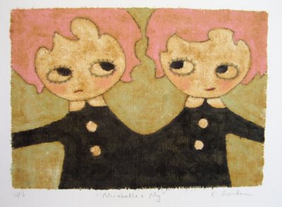 I've really never at any point considered myself craft-sy. Artistic? In certain mediums, sure. Creative? I'd really like to think so. But craft-sy? Certainly not. I've never had a knack for it. Not even sure that I wanted to have the knack. In fact, if memory serves, the anxiety of having to tackle crafts projects practically each week was the reason why it was absolutely agonizing to attend Brownies, and the reason why I quit as soon as I was allowed. Crafts were also the reason why I loathed day camp (except for the time when we made tie-die shirts. I remember digging that for some bizarre reason... thank goodness I grew outta that phase).
 The "I Heart Goody Of The Week" -- Moccu's e-cards. I have nothing against Hoops & Yoyo, mind you, but I have to say that Moccu's selection of e-cards are vastly unique, and will certainly be remembered amidst all the other (yawn) very average greetings piling up in your recipient's inbox. They look so darn great exactly as they are, but a few are even 100% customizable, so that you decide what characters, actions, heading style & music you want. You'll have way too much with these (I know I did this past New Year). And they're free. YAY, Moccu! And, (bonus) it's so fun to say: moccu - moccu - moccu!
 The "I Heart Site Of The Week" is No! SPEC. -- "Spec is a new four letter word. Learn the facts about why spec work is a bad idea for both clients and designers. Then join us and say no to spec www.no-spec.com."
Click on this post's title to go to the No! SPEC index page, or go directly to a list of 10 reasons to say No!
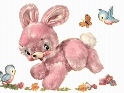 When I was an infant, my favourite toy was a pink plastic bunny. It says so right in my baby book. When I read this recently, after not having seen this book for many years, it occured to me that pink bunnies were very important to me in my life, once upon a time. How so, exactly?
 When I was two years old, as the story goes, (and this story has been told often in my family), I had to go in for surgery on one of my eyes. It was apparently most traumatic for me, and my mother's face looks shocked even still, when she re-tells how I kicked and screamed and cried and refused to succumb, even after receiving twice the normal dose of sedative prior to the operation. My mother felt so guilty at leaving me in such a frenzied, disturbingly doped-up state that she promised herself to make it up to me somehow. So the next day when she collected me, and I was sporting for the first time ever, what I proudly proclaimed to be "pretties," we made a stop at the drugstore, and I was told I could pick whatever my heart desired. So what did I choose? Above all other things? A pink bunny. This time, PLUSH (yeaaah).
It's a little bit facinating to me, i do have to admit. Did I pick this bunny merely because it resembled the plastic toy I had already owned, or did I pick it because of something it represented to me? Comfort? Fun? Security? Companionship? Or did pink bunnies simply just appeal to me by virtue of the fact that they were PINK, and that they were cute BUNNIES? (Dr. Melfi would know -- I'm sure of it).
At any rate, because I decided that the purpose of this blog is to celebrate the things that are near and dear to me; that inspire me, bring me happiness, calm, and all-around warm fuzzy feelings, I felt I should honour that which first appealed to my senses, before all other things - the very first "archetypal" object (?) to imprint itself upon me: a pink bunny.
So there.
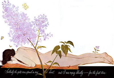 I just have to say a huge thank you to Leif Peng for his fascinating and oh so impressive collection of illustrations from the 40's & 50's. I check his blog, "Today's Inspiration," well -- daily for inspiration. I could just scroll & click for hours if I let myself. This deliciously pretty piece of melodrama posted recently, caught my eye. It's caption says, "Suddenly the gates were opened in my heart and I was crying blindly - for the first time." Why is she naked? What has made her cry so... blindly? And WHERE is she? Such lovely lilacs surround her!
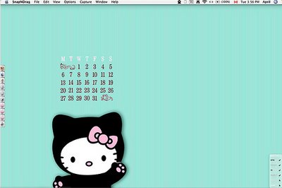
Allow me to introduce my "Hello Kitty Aqua Pinstripe" custom desktop. I made it at a/g's on the 2nd last day of "March Conference."
You see, we're nerds (yes, no worries, I am fully aware that we are). And when we get together, we sit on our respective macs and do silly things like make custom desktops, based on relevant concepts such as, "ice cream colours." Then we show eachother our results, present the finer features such as pinstriping detail or what-have-you, and praise eachother up & down for our efforts. That's ok to do, right? We're still kinda cool, right??
Just to forewarn you, however... I may or may not reverse the colours on this, so that pink is the background colour and aqua is Hello Kitty's bow colour. You know, a variation on the original - for kicks. I'm just letting you know now. It's only fair to know what kind of person you're dealing with here (and yes, I'm aware that this nerdiness is only compounded by the late hour of this post).
previously on i heart to blog
- mother's my new mother now
- sunday scribblings - hi, my name is...
- the heart wants what it wants
- yeun hearts serenity now
- mmm... mStand
- photo friday 05•18•07 - large
- thursday challenge - motion
- eyes turned upward... on my desktop
- i heart linnea gits gifts
- photo friday 04•27•07 - relaxation
i heart archives
- 03.12.2006
- 03.19.2006
- 03.26.2006
- 04.02.2006
- 04.09.2006
- 04.16.2006
- 04.23.2006
- 04.30.2006
- 05.07.2006
- 05.14.2006
- 05.21.2006
- 05.28.2006
- 06.04.2006
- 06.11.2006
- 06.18.2006
- 06.25.2006
- 07.02.2006
- 07.09.2006
- 07.16.2006
- 07.23.2006
- 07.30.2006
- 08.13.2006
- 08.20.2006
- 08.27.2006
- 09.17.2006
- 10.08.2006
- 10.15.2006
- 11.05.2006
- 11.19.2006
- 12.03.2006
- 12.17.2006
- 01.07.2007
- 02.11.2007
- 02.18.2007
- 03.11.2007
- 03.18.2007
- 03.25.2007
- 04.01.2007
- 04.08.2007
- 04.15.2007
- 04.22.2007
- 05.13.2007
- 05.27.2007
- 07.08.2007
- 09.23.2007
- 10.07.2007
i heart site picks
- the skinny
- stuck in the 80's
- candykiller
- misprinted type
- gigposters.com
- juju's delivery service
- j. otto seibold
- the creative bushido
- thinking with type
- brian rea
- bizart
- just for the F of it
- pixel gasoline
- chromasia
- no! spec
i heart goodies
- veer activity books
- dark horse buffy desktop
- i heart 80's videos
- 50 AIGA symbols
- free site?
- culture fool challenge
- essence of rabbit
- j. otto's bubblesoap
- grandPerspective
- behind the typeface: cooper black
- pantone spring color report
- brilliant button maker
- fuse fun bouncy ball
- monochrom
- 25 best free fonts
- moccu e-cards
i heart working for
i heart these daily
i heart & want to marry
- iso50
- moccu
- s. britt
- so fake
- grotesk
- otterball
- four5one
- candy killer
- fiona hewitt
- sky and snow
- homestarrunner
- charles s. anderson
- design bureau of amerika
i heart thursday challenge
i heart photo friday
- relaxation
- heat
- remarkable
- health
- automotive
- home
- masterpiece
- adolescence
- famous
- golden
- postsecret
- china 2006
- the apple blog
- doing it to death
- all about the pretty
- le moleskine à beleg
- papeis por todo o lado
- secret life of shi sensei
- tamar graphics connection
i heart sunday scribblings
i heart blogworthiness
i heart procrastinating
i heart heavy rotation
i heart books on the go
i heart to covet
- EQ3
- moo
- lush
- (RED)
- relish
- holga
- ugly dolls
- matt & nat
- miso pretty
- sugar paper
- lovely design
- the cupcake shoppe
- pantone flight stools
- wallpaper from the 70's
- red maloo laptop sleeves
i heart learning css
- css vault
- css import
- css beauty
- css lookup
- 10 css tricks
- css examples
- css bookmarks
- css try it editor
- max design css
- css zen garden
- mandarin design
- holy css zeldman
- eric meyer on css
- brainjar css positioning
- css from the ground up
- css web design from scratch

a t o m . 0 . 3
