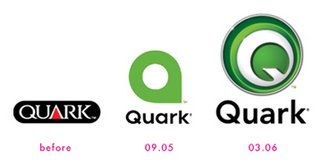
the hurried evolution of the Quark logo...
For the second time in mere months, Quark has debuted a new logo. Seems the one unveiled in September of last year was met with scathing criticism and angry accusations of theft and/or of just not trying hard enough. In case you missed the brouhaha, allow me to visually bring you up to speed:
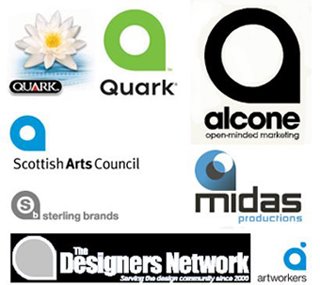
 You be the judge (hmmm...). Quark claims it was a fluke, and a simple mistake. And while that may very well be true, I feel compelled to point out that it doesn't even really look like a q. It looks more like an a. But the colour is very nice, and I was impressed when I read what Lester Haines at theregister.co.uk had to report on it:
"In support of the launch of Quark’s new brand identity, Pantone Inc., the global authority on color and provider of professional color standards for the design industries, has dubbed PANTONE 368 as “Quark Green.”According to Leatrice Eiseman, executive director of the Pantone Color Institute, renowned color psychologist, and author of five books on color, “PANTONE 368 was the perfect choice for an innovative company such as Quark. This yellow green, a symbol of growth, is invigorating and revitalizing, and breathes new life into a brand, in addition to drawing attention to it. By embracing this color for its new logo, Quark is giving its customers the connotation of the continuing growth of ideas and concepts, and that it is on the edge of new technologies.”
That's kinda cool, I guess. And Quark seems to have done their best to try and quickly make everything all better with this latest offering.
So, do I like it? I'm not altogether sure, but I think I do. At least this one more accurately resembles a Q. It doesn't really matter all that much to me anyhow, to tell you the truth. I switched to InDesign a year ago.
So, do I like it? I'm not altogether sure, but I think I do. At least this one more accurately resembles a Q. It doesn't really matter all that much to me anyhow, to tell you the truth. I switched to InDesign a year ago.
Dare to compare: Quark vs. InDesign
For more on this quirky controversy: Sometimes a Logo is Just a Logo
previously on i heart to blog
i heart archives
- 03.12.2006
- 03.19.2006
- 03.26.2006
- 04.02.2006
- 04.09.2006
- 04.16.2006
- 04.23.2006
- 04.30.2006
- 05.07.2006
- 05.14.2006
- 05.21.2006
- 05.28.2006
- 06.04.2006
- 06.11.2006
- 06.18.2006
- 06.25.2006
- 07.02.2006
- 07.09.2006
- 07.16.2006
- 07.23.2006
- 07.30.2006
- 08.13.2006
- 08.20.2006
- 08.27.2006
- 09.17.2006
- 10.08.2006
- 10.15.2006
- 11.05.2006
- 11.19.2006
- 12.03.2006
- 12.17.2006
- 01.07.2007
- 02.11.2007
- 02.18.2007
- 03.11.2007
- 03.18.2007
- 03.25.2007
- 04.01.2007
- 04.08.2007
- 04.15.2007
- 04.22.2007
- 05.13.2007
- 05.27.2007
- 07.08.2007
- 09.23.2007
- 10.07.2007
i heart site picks
- the skinny
- stuck in the 80's
- candykiller
- misprinted type
- gigposters.com
- juju's delivery service
- j. otto seibold
- the creative bushido
- thinking with type
- brian rea
- bizart
- just for the F of it
- pixel gasoline
- chromasia
- no! spec
i heart goodies
- veer activity books
- dark horse buffy desktop
- i heart 80's videos
- 50 AIGA symbols
- free site?
- culture fool challenge
- essence of rabbit
- j. otto's bubblesoap
- grandPerspective
- behind the typeface: cooper black
- pantone spring color report
- brilliant button maker
- fuse fun bouncy ball
- monochrom
- 25 best free fonts
- moccu e-cards
i heart working for
i heart these daily
i heart & want to marry
- iso50
- moccu
- s. britt
- so fake
- grotesk
- otterball
- four5one
- candy killer
- fiona hewitt
- sky and snow
- homestarrunner
- charles s. anderson
- design bureau of amerika
i heart thursday challenge
i heart photo friday
- relaxation
- heat
- remarkable
- health
- automotive
- home
- masterpiece
- adolescence
- famous
- golden
- postsecret
- china 2006
- the apple blog
- doing it to death
- all about the pretty
- le moleskine à beleg
- papeis por todo o lado
- secret life of shi sensei
- tamar graphics connection
i heart sunday scribblings
i heart blogworthiness
i heart procrastinating
i heart heavy rotation
i heart books on the go
i heart to covet
- EQ3
- moo
- lush
- (RED)
- relish
- holga
- ugly dolls
- matt & nat
- miso pretty
- sugar paper
- lovely design
- the cupcake shoppe
- pantone flight stools
- wallpaper from the 70's
- red maloo laptop sleeves
i heart learning css
- css vault
- css import
- css beauty
- css lookup
- 10 css tricks
- css examples
- css bookmarks
- css try it editor
- max design css
- css zen garden
- mandarin design
- holy css zeldman
- eric meyer on css
- brainjar css positioning
- css from the ground up
- css web design from scratch

a t o m . 0 . 3

0 Responses to “quark's logo quandary”
Leave a Reply