apple a day / 1997•1998
5.06.2006 by a•pril ![]()
![]()
 "Although officially produced in celebration of Apple's 20th birthday, the 20th Anniversary Mac was released close to a year after the fact, in late Spring, 1997. And a truly unique Mac it was. The Motherboard was similar to that of the PowerMac 5500, and it was based on the same 603e processor, running at 250 MHz. The real innovation of the 20th Anniversary Mac was its unique shape, and advanced sound and video features. It came with an integrated TV/FM Radio System, an S-Video Input, and a custom sound system designed by Bose, with integrated stereo speakers, and a separate sub-woofer (it also included a 33.6Kbps GeoPort modem). The Twentieth Anniversary Mac was a limited edition, and sold for nearly $10,000. Its price was cut to as low as $1,999 and it was discontinued in March 1998." (picture credits: Apple Computer)
This byte of Apple's history from Wired's, "30 Years of Apple Products."
i heart ugly dolls
5.05.2006 by a•pril ![]()
![]()
 Kid Robot's Ugly Dolls are the best. REALLY. Forget Disney. Forget Care Bears or Strawberry Shortcake. Ugly Dolls couldn't be any cooler if they tried. Seriously. Their creators, David Horvath and Sun-Min Kim, should make a Saturday Morning Cartoon about them. Then a Pixar movie. Then maybe even a video game and a breakfast cereal, and lunch boxes... OH... but maybe that would destroy the cool. Hmm. Yeah, it's risky - unless perhaps if Burton got behind it... Hmm... but even then it might be a slippery slope... ANYWAY, I think you get my point. Ugly Dolls are the best. And I want to collect 'em ALL. Every last one.
apple a day / 1997•1998
by a•pril ![]()
![]()
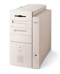
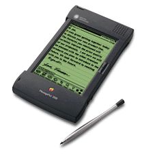 NEWTON MESSAGE PAD 2000
"Announced in March 1997, the Newton Message Pad 2000 was an impressive upgrade to the Newton platform. Based on a 162 MHz StrongARM 110 processor, the NMP 2000 was almost 10 times faster than its predecessor, and had twice as much RAM (5 MB). It included a slightly larger screen, with twice as many pixels as the NMP 130, which was capable of 16-level grayscale. The NMP 2000 also featured a new InterConnect port for many different types of OS connections, included support for 2 PCMCIA cards, sold for $799 and was discontinued in February 1998." (picture credits: EveryMac.com)
This byte of Apple's history from Wired's, "30 Years of Apple Products."
no candy is pretty sweet
by a•pril ![]()
![]()
 Fawn E. Gehweiler of No Candy has a pretty sweet little thing going. Her work has a... je ne sais pas quality to it. I can't decide whether her illustrations would be cute if they weren't kinda ugly, or if they'd be kinda ugly if they weren't so unconventionally cute. One thing that I am sure of is that Fawn's style is one of a kind and clearly in demand... she has not only an impressive lists of clients (drool), exhibitions, and published works, but also, sadly, an appallingly long list (with photographic proof) of unseemly llustrators who've blatently ripped off her creations! (tsk, tsk! Now that part is not very sweet at ALL).
apple a day / 1997•1998
5.04.2006 by a•pril ![]()
![]()
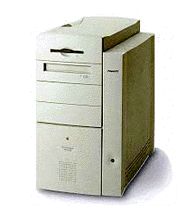
 eMATE 300
The eMate 300 ran on a 25 MHz ARM 710a processor, had 3 MB of RAM, and ran Newton OS 2.1. It had a backlit-grayscale screen similar to that of the NMP 2000, but with a landscape form factor. It also included a single PCMCIA slot and a Newton InterConnect port. The eMate 300 sold for $799 exclusively to the education sector, and was discontinued in February 1998." (picture credits: EveryMac.com)
This byte of Apple's history from Wired's, "30 Years of Apple Products."
behold ! frankendoodle !
by a•pril ![]()
![]()
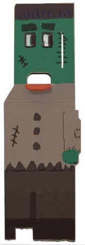 Well, after my last post on Box Doodle, I had figured I should give it a go and submit something. And YES, I used the online doodle tool, and I realize it's not very glue-paper-scissors-friendly or terribly craftsy at all... but doodling FUN was a mere mouse-click away... and the little pens and colour tablets looked so inviting. And I don't mind telling you that the box shape just SCREAMED OUT to be a Frankendoodle! Seriously... it was BEGGING to be created. I just HAD to. (You may now, with childlike wonderment, marvel at my artistic prowess).
box doodle is oodles of fun
by a•pril ![]()
![]()
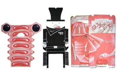 Box Doodle Project issues a rather unique, compelling artistic challege and "the rules are quite simple: rearrange a box to make any kind of figure or object. Make the most of the least." I love this because (not that I'm really one to talk), it's refreshingly lo-tech, and paint, scissors, glue and oodles of imagination are called upon here. How freeing to occasionally push the SLR and the CS2 aside... (ok, well there is an online Box Doodle Tool that lets you doodle electronically which i think I might try... but again... I'm not necessarily one to talk... I'm just saying...)
how did I not make the connection?
by a•pril ![]()
![]()
 When I first saw the new mac ads, of course it crossed my mind that the "PC" resembled Bill Gates. But being that Bill Gates looks like the vast majority of nerds (and I figured "nerd" is clearly what they're going for here), I looked no deeper. Just this morning, however, a/g sent me a link to a blog called, technocato, and suddenly it was all made so crystal clear. Of course the "mac" is Steve Jobs! D'uh! Now how did I not make the connection before? So even though I can't take credit for drawing this conclusion on my own, I do, clearly, have more time on my hands than techocato-guy, and I dug up my own photos to best illustrate the point. Hmm... yeah. There's no way the casting was a coincidence...
 apple a day / 1997•1998
5.03.2006 by a•pril ![]()
![]()
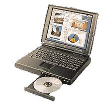
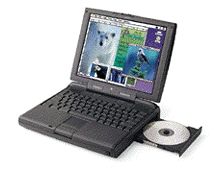 POWERBOOK 3400
"When it was announced in February 1997, The PowerBook 3400 was the fastest portable computer in the world. After several years of PowerBook trouble, Apple hoped to revitalize its portable market share with this new PCI-based model. Its drive bay was compatible with the older 5300 model, and it was the first PowerBook to utilize the 1 MB IrDA Infra-red standard. The 3400 ranged from $4,500 for 180 MHz and no CD-ROM to $6,500 for 240 MHz, fully loaded. (The 240 MHz model was announced at the same time as the slower models, but shipped several months later.)" (picture credits: John Greenleigh/Flipside Studios)
This byte of Apple's history from Wired's, "30 Years of Apple Products."
i heart stumbling on singing anime
by a•pril ![]()
![]()
 Um... well, as you may know I heart to stumble upon things on the net whenever possible. Each time I click that little stumble icon, I never know what I'm going to get. It's kinda like a slot machine -- sometimes you' get lucky and sometimes you're unlucky. Well, I'm not sure what category dojo's loituma falls under, but how do I remain unaffected by this happy-go-lucky anime girl swinging a leek (?) and singing her heart out on a neverending loop? Weird, indeed, but strangely catchy. It's the feel good singing anime flash film of the year! (...and what is she singing about? Leeks? Cooking with leeks? Shopping for leeks? God, I'm just dying to know!)
penelope
by a•pril ![]()
![]()
 Hey, do you know who is a really, really great illustrator? Penelope. And, do you know who just happens to be the creator of Illustration Friday? Yep. Penelope.
me so heart miso pretty
by a•pril ![]()
![]()
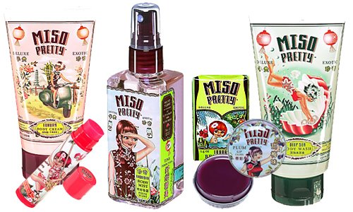 Who even knows sometimes how these happy accidents occur, but this morning, through linking upon links, I discovered a fantastic portfolio of work by a designer named fiona hewitt. Straight away, her splash page told me I was going to adore her work... but joy of joys! I quickly realized that she is the graphic designer behind the miso pretty cosmetic line: a captivating collection of the most beautifully packaged lotions and potions ever. Now mind you, I have never used Miso Pretty products, but about a year and a half ago, in an Ulta in Scottsdale, I was stopped dead in my tracks whilst perusing their aisles by these gorgeous little boxes and pots and tubes. I seriously stood admiring them for a good 15 minutes, frantically trying to justify buying the whole line based on their packaging alone. I really, really worked hard at it... but in the end, just couldn't do it (I curse you, perpetually meager budget!) But each time after, when I would visit that same store, I'd bee-line to that section yet again to admire the pretty little packages. So I'm very, very pleased to have accidentally found her site. And you know what? All of Hewitt's work is ohso pretty. She's fantastic!
2 apples today / 1997•1998
5.02.2006 by a•pril ![]()
![]()
 POWER MACINTOSH 8600
"Although announced in February 1997, it was not until June that the 8600 actually shipped in bulk. It came in the same innovative case design as the 9600, and ran on a 200 MHz 604e. It included an internal Zip drive (a Power Mac first). It also included video input and output. The 8600 used the Nitro motherboard, as did its predecessor, the 8500. The 8600 initially sold for $2,700. In August, Apple announced "speed bumped" versions of the 8600 with a 250 or 300 MHz "Mach 5" 604e. Like its predecessor, the 8600/300 did not ship for several months after it was announced due to supply problems. The 8600 was discontinued in early 1998." (picture credits: Apple Computer)
 POWER MACINTOSH 9600
"The flagship of what might be termed the third wave of Power Macs, the 9600 was announced in February 1997. It was packaged in an eye-pleasing new tower design, built to make its insides more easily accessible. It ran on 233, 200 or dual 200 MHz 604e's. Although it looked different on the outside, the motherboard was basically the same design as that of the 9500. The 9600 was originally priced at $4,700 for the dual 200 MHz configuration, $4,200 for the single 233 MHz, and $3,700 for the single 200 MHz. In August, the 9600 was "speed bumped" with either a 300 or 350 MHz "Mach 5" chip, a new high speed variant on the 604e. The 350 MHz version barely shipped before Apple took it off the market, partially because of the small supply of 350 MHz chips, but mostly because their upcoming PPC 750-based "Gossomer" Macs (the PowerMac G3) would eclipse it both in performance and price." (picture credits: John Greenleigh/Flipside Studios)
being a cartoon is truly cool
by a•pril ![]()
![]()
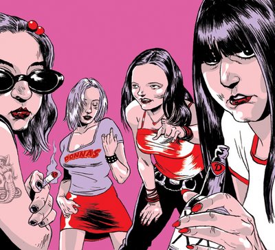 So still stumbling, and I come across an oline portfolio for Tomer Hanuka and I think, "eww, some of his work is pretty graphic, but I guess that's comic book illustration for ya," and then I scroll to a way funky illustration he's done of The Donna's and then immediately think, "wow, I just love the Donna's, because if I was a rock star like them, I would totally commission a comic book illustrator with a name like Tomer Hanuka to draw me, because that is truly cool." I mean, it really is. There's just no denying it.
i heart stumbling on alice
by a•pril ![]()
![]()
 Imagine my pleasant surprise when I stumbled upon Feel Good Anyway's interactive Alice flash short, created to promote a Scholastic pop-up book, Alice In Wonderland by J. Otto Seibold (Olive The Other Reindeer). What a hip, super-cute way to promote a kid's book! Quite the visual treat.
apple a day / 1996•1998
5.01.2006 by a•pril ![]()
![]()
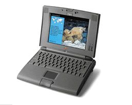
 POWERBOOK 1400c/cs
"Announced in October 1996, The PowerBook 1400 was a partial answer to a number of questions about recent PowerBooks. Powered by the same 117 MHz 603e as the 5300, The 1400 was the first PowerBook to include an internal CD-ROM drive (6X). The bay for the sleep-swappable drive could also accommodate a variety of other storage options, including MO and zip drives. The RAM came in stackable modules (another PowerBook first) allowing for up to 64 MB of RAM. The 1400 also included an Internal expansion slot for video-out or Ethernet cards, and two PC Card slots that could accommodate two Type II PC Cards or one Type III PC Card. Faster models with a small L2 cache and an 8x CD-ROM drive were also released. The 1400 was discontinued early in 1998." (picture credits: Apple Computer)
This byte of Apple's history from Wired's, "30 Years of Apple Products."
goody of the week - good ol' coop
by a•pril ![]()
![]()
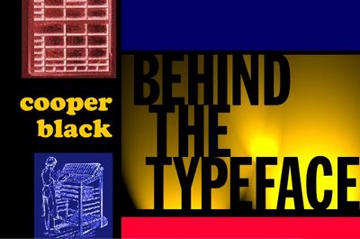 In keeping with this week's typography theme, the goody I've chosen is truly bookmark-worthy. Of course we are all familiar with VH1's popular Behind The Music series -- but what about... Behind The Typeface? This short film is a masterful parody of BTM, featuring the rise, fall, and eventual whirlwind resurgence of Cooper Black's typographic career -- complete with testimonials from Black's friends and relative's. It's so FUN... and so revealing! I mean, who knew that in the 70's, as a result of being swept up in the tempting, decadent world of rock 'n roll, good ol' Coop developed an unfortunate addiction to cocaine?!?. HaHaHa! This little goody will make you wish, like me, that it's creator, Cheshire Dave, would make a whole darn series of these. It's just too, too clever! Happy viewing.
site of the week - thinking with type
by a•pril ![]()
![]()
 This noteable site is the on-line companion to the book "Thinking with Type: A Critical Guide for Designers, Writers, Editors, & Students," by Ellen Lupton. In a educational, surprisingly entertaining, and humorous fashion, Lupton presents the hows ands whys of type, and how best to utilize it as a designer. She covers a lot of typographical terrain, such as anatomy, x-heights, size, spacing, kerning, alignment, hierarchy and grids - and it doesn't put you to sleep... honest! I highly recommend taking a look at Lupton's summary of A Few Good Fonts (because it's all about about quality over quantity), and definitely download her presentation, "Make the World Safe for Typography," delivered at the AIGA National Conference, September, 2005. Her hilarious (though I believe truly heartfelt) plea is for all designers to ban together to fight crimes against typography -- well, hilarious if you're a typography nerd -- and you probably are if you've read through this whole post (not that there's anything wrong with that). Enjoy!
2 apples today / 1994•1995
4.30.2006 by a•pril ![]()
![]()
 POWERBOOK 540c
 POWERBOOK 550c
This byte of Apple's history from Wired's, "30 Years of Apple Products."

previously on i heart to blog
- mother's my new mother now
- sunday scribblings - hi, my name is...
- the heart wants what it wants
- yeun hearts serenity now
- mmm... mStand
- photo friday 05•18•07 - large
- thursday challenge - motion
- eyes turned upward... on my desktop
- i heart linnea gits gifts
- photo friday 04•27•07 - relaxation
i heart archives
- 03.12.2006
- 03.19.2006
- 03.26.2006
- 04.02.2006
- 04.09.2006
- 04.16.2006
- 04.23.2006
- 04.30.2006
- 05.07.2006
- 05.14.2006
- 05.21.2006
- 05.28.2006
- 06.04.2006
- 06.11.2006
- 06.18.2006
- 06.25.2006
- 07.02.2006
- 07.09.2006
- 07.16.2006
- 07.23.2006
- 07.30.2006
- 08.13.2006
- 08.20.2006
- 08.27.2006
- 09.17.2006
- 10.08.2006
- 10.15.2006
- 11.05.2006
- 11.19.2006
- 12.03.2006
- 12.17.2006
- 01.07.2007
- 02.11.2007
- 02.18.2007
- 03.11.2007
- 03.18.2007
- 03.25.2007
- 04.01.2007
- 04.08.2007
- 04.15.2007
- 04.22.2007
- 05.13.2007
- 05.27.2007
- 07.08.2007
- 09.23.2007
- 10.07.2007
i heart site picks
- the skinny
- stuck in the 80's
- candykiller
- misprinted type
- gigposters.com
- juju's delivery service
- j. otto seibold
- the creative bushido
- thinking with type
- brian rea
- bizart
- just for the F of it
- pixel gasoline
- chromasia
- no! spec
i heart goodies
- veer activity books
- dark horse buffy desktop
- i heart 80's videos
- 50 AIGA symbols
- free site?
- culture fool challenge
- essence of rabbit
- j. otto's bubblesoap
- grandPerspective
- behind the typeface: cooper black
- pantone spring color report
- brilliant button maker
- fuse fun bouncy ball
- monochrom
- 25 best free fonts
- moccu e-cards
i heart working for
i heart these daily
i heart & want to marry
- iso50
- moccu
- s. britt
- so fake
- grotesk
- otterball
- four5one
- candy killer
- fiona hewitt
- sky and snow
- homestarrunner
- charles s. anderson
- design bureau of amerika
i heart thursday challenge
i heart photo friday
- relaxation
- heat
- remarkable
- health
- automotive
- home
- masterpiece
- adolescence
- famous
- golden
- postsecret
- china 2006
- the apple blog
- doing it to death
- all about the pretty
- le moleskine à beleg
- papeis por todo o lado
- secret life of shi sensei
- tamar graphics connection
i heart sunday scribblings
i heart blogworthiness
i heart procrastinating
i heart heavy rotation
i heart books on the go
i heart to covet
- EQ3
- moo
- lush
- (RED)
- relish
- holga
- ugly dolls
- matt & nat
- miso pretty
- sugar paper
- lovely design
- the cupcake shoppe
- pantone flight stools
- wallpaper from the 70's
- red maloo laptop sleeves
i heart learning css
- css vault
- css import
- css beauty
- css lookup
- 10 css tricks
- css examples
- css bookmarks
- css try it editor
- max design css
- css zen garden
- mandarin design
- holy css zeldman
- eric meyer on css
- brainjar css positioning
- css from the ground up
- css web design from scratch

a t o m . 0 . 3
